
Announcing Benjamin Moore’s Color of the Year 2026
Enduring Style Meets Modern Sensibility
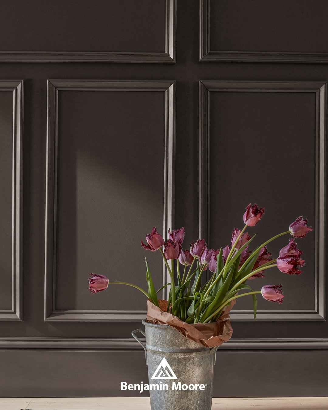
Silhouette AF-655
Introducing the Benjamin Moore Color of the Year 2026, Silhouette AF-655, which weaves rich espresso hues with refined notes of charcoal. Silhouette is a color that can be designed in a variety of styles and spaces with such a distinctive presence. It is comparative to a tailored touch in fashion and can elevate any design and take it from expected to exceptional.
Explore the distinctive presence of this exceptional hue and the rest of the Color Trends 2026 palette by visiting us in-store.
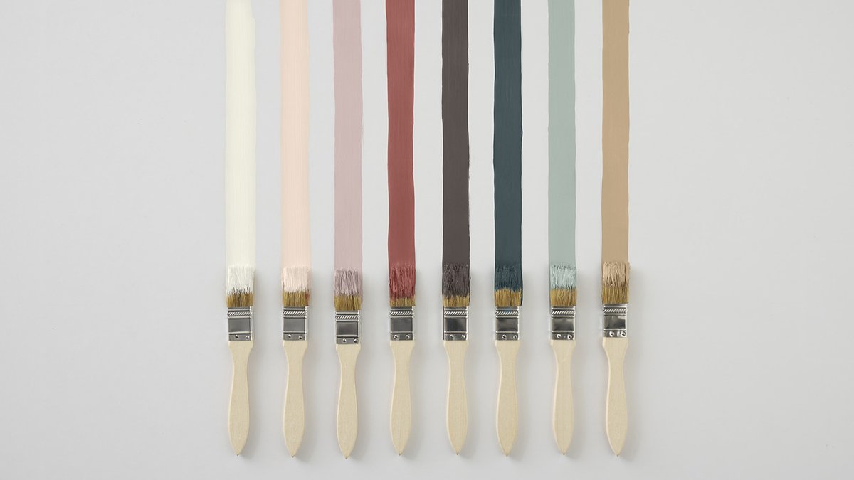
Color Trends 2026 Palette
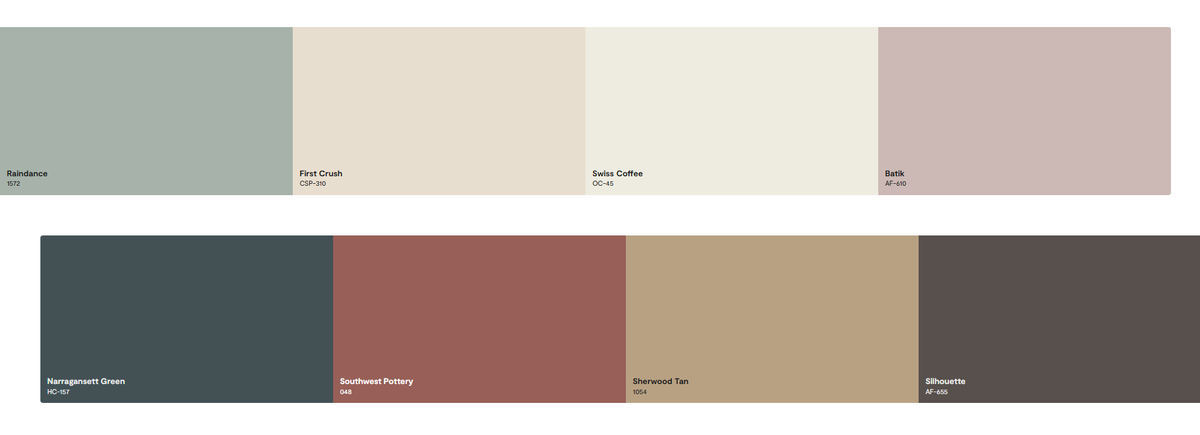
Take a refined approach to color with the eight graceful, sophisticated hues that make up the Benjamin Moore Color Trends 2026 palette. Balanced by two distinct groupings—enchanting pales and handsome midtones—these handpicked colors will bring a highly curated effect to any space.
Each hue notes romanticizes the classics, tailoring, and craftmanship. It's a palette that balances between handsome and soft; traditional and poetic; sartorial and fluid.
Silhouette then weaves a narrative of refined style and grace into this layered palette of light enchanting pales and handsome midtones.